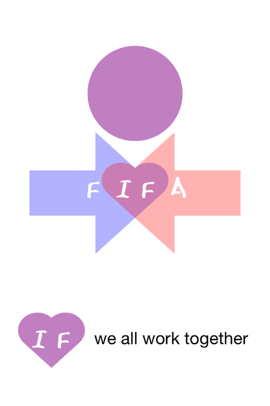
Design by E.Salah
The design is based on two arrows crossing each other (represents 2 people from different nations) and where the arrows cross it forms a heart.
The arrows change in to the shape of a child by adding a circle as a head. Adding the word FIFA over the logo means the word 'if' sits in the heart. If we work together harmony will be produced.
Also the use of pastel colours shows neutrality and it doesn't represent one nation so no country can claim it as their logo (nations flags , mainly prime colours) The arrows are blue and pink which show male and female.
Other designs were:
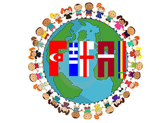
The thinking behind this design was the use of peole of all races holding hands around the world to show the coming together of all different countries. The FIFA letters have each country involved in this Comenius project to make it personal to us and how we are helping to bring people of different cultures together as we are the people of the future. The future of Europe.